How to add any CSS framework to your project — Part 5
Learn how to fully customize Bootstrap Alert components using SCSS variables and vendor overrides in a structured design system.
In the previous article, we explored different levels of customization and how to modify a primary button according to the design. By the end, you had changed Bootstrap variables and one additional file:
_btn.scss.
Forms and vendor folders
Today, we will explore the main differences between your style folders — forms and vendor — and how to customize something more complex: the Alert component from the Bootstrap CSS framework.
Forms and vendor folders are similar in their purpose — both contain overwritten styles of form elements and third-party components that can’t be adjusted via variables. This means that if you plug in any third-party library and want to modify its styles, those styles should be placed in either of these folders.
However, the key difference lies in their names. The forms folder is used only for styles related to form elements. The vendor folder is for everything else — including form element styles, if they need to be modified inside a specific component. In reality, this is an infrequent case, since consistency is a core principle of any design system.
The current state of the project structure is as follows:
/src
  /styles
    /common
    /components
    /forms
      ├── _btn.scss
    /mixins
    /variables
      ├── _bootstrap.scss
      ├── _palette.scss
      ├── variables.scss
    /vendor
    ├── app.scss
    ├── vendor.scss
  styles.scss
Alert component modification
As we discussed in Part 4, there are four different levels of customization for every form element or component in your design system:
Alert components across the entire project.
Specific Alert components (e.g., success, warning, with icons, dismissible, etc.).
Alert components as part of another component (e.g., inside a modal window).
Alerts inside your custom components.
So, as a first step, we need to review the desired changes and decide where to make them. Let’s compare the custom design of such components with their default state in the Bootstrap framework.
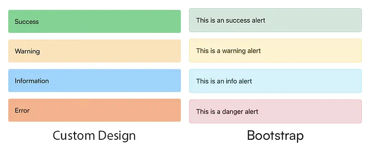
As we can see in the image above, our desired result should be implemented at the first two levels of customization. The majority of changes — font-family, font-weight, padding, color, border-width, border-radius — should be applied to all Alert components. The background-color property should be changed for specific Alert variants: success, warning, info, and danger.
Bootstrap variables
To begin, we need to check the Bootstrap variables file — _bootstrap.scss — and see what we can use to make the required changes. Below are the variables we need to modify:
...
$font-family-sans-serif: Satoshi, sans-serif;
...
$alert-padding-y: 16px;
$alert-padding-x: 16px;
$alert-border-radius: 4px;
$alert-border-width: 0px;
...
Since the Satoshi font is not installed by default in any OS, you will need to download and install it manually from this website. In upcoming articles, we’ll explore the best way to add custom fonts to your project.
The first line sets the default font-family for the entire project, including Alert components. The remaining variables modify the Alert component specifically: padding, border-radius, and border-width.
Next, we’ll replace the default text and background colors of specific Alert components in the _palette.scss file. Please update the following variables there:
...
$success-text-emphasis: #141414;
$info-text-emphasis: #141414;
$warning-text-emphasis: #141414;
$danger-text-emphasis: #141414;
...
$success-bg-subtle: #69d68f;
$info-bg-subtle: #91d5ff;
$warning-bg-subtle: #ffe1b8;
$danger-bg-subtle: #ffaf85;
...
Important note: there is a bug in the second article — when we import custom Bootstrap variables in the
vendor.scssfile, we need to move the import line higher and place it right after the import of Bootstrap’s default variables. This change is crucial for the setup, as Bootstrap maps SCSS variables into CSS variables. The correct structure of the file should be:
...
@import 'bootstrap/scss/functions';
@import 'bootstrap/scss/variables';

// custom variables
@import 'variables/variables';

@import 'bootstrap/scss/maps';
@import 'bootstrap/scss/mixins';
@import 'bootstrap/scss/utilities';
...
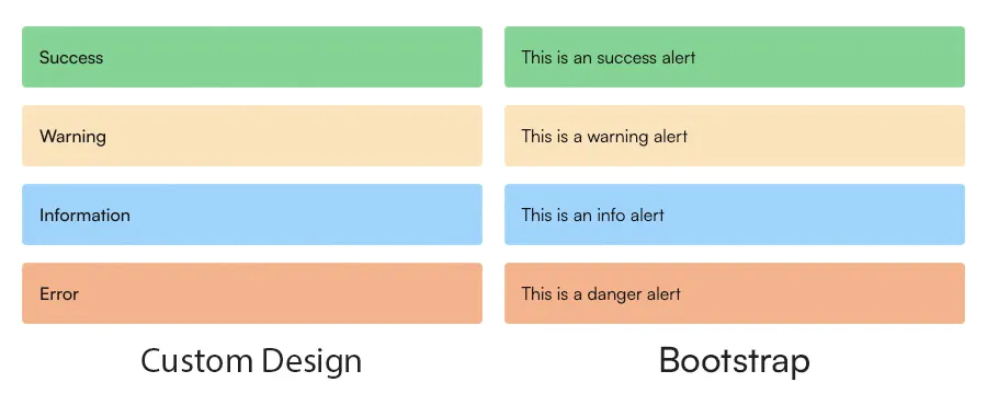
The result of these changes is shown in the image below. As you can see, we are almost there:
Vendor styles modification
Since not everything can be customized via Bootstrap variables, some styles must be manually overwritten. In this case, only one additional change is required.
Create a new file — _alert.scss — and place it in the /src/styles/vendor folder:
// alert
.alert {
    font-weight: 500;
}
Use the same approach for all third-party component styles you want to override in your project. Create a new file named after the component and place all related styles inside it. This will help maintain a clear and consistent structure.
Then, update the app.scss file by importing the new file:
// forms styles
@import './forms/_btn';

// vendor styles
@import './vendor/_alert';
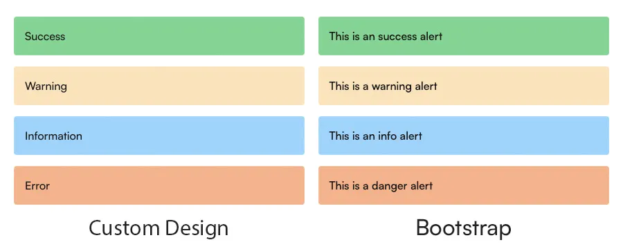
And our final result is:
Conclusion
In this article, we explored how to customize the default Alert component from the Bootstrap framework to match your custom design. By the end, you should have:
Updated Bootstrap variables related to Alerts and the color palette.
Created an
_alert.scssfile with overridden styles that couldn’t be changed via variables.
This is the final article in the current series on integrating the Bootstrap framework. In future posts, I’ll continue exploring best practices for building and maintaining design systems. Stay tuned!