How to add any CSS framework to your project — Part 4
From variables to real design: how to properly customize Bootstrap buttons for a scalable UI system.
In the third part we explored how to extract the color system from Bootstrap and structure it according to your needs. As a result, you ended up with a separate
_palette.scssfile containing all the color variables and their shades.
Levels of customization
In this article, we’ll review how to modify a simple primary button to match your custom design. There are several levels of buttons we might want to customize. As a first step, we need to clarify what exactly we’re trying to change:
Buttons across the entire project.
Buttons with specific characteristics (e.g., primary, default, large, small, etc.).
Buttons inside another component (e.g., a primary button inside the date-picker component).
Buttons inside your custom component.
At the same time, there are several places where changes can be applied to achieve the desired result. The table below helps you determine where to make changes based on what you want to achieve.
Levels of button customization
Types of buttons | Where to change |
|---|---|
All buttons | Bootstrap variables |
Forms styles | |
All specific buttons | Bootstrap variables |
Forms styles | |
Buttons inside Bootstrap component | Bootstrap variables |
Vendor styles | |
Buttons inside your custom component | Components styles |
Angular component styles |
In the table,
forms,vendor, andcomponentsrefer to specific folders inside your/src/stylesdirectory. We’ll explore the differences between these folders in future articles.
Primary button modification
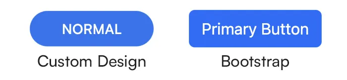
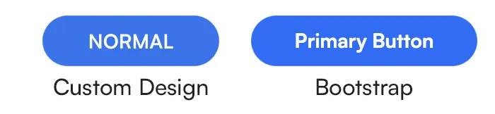
Let’s modify a primary button according to a custom design system. On the right side of the image above, you see the default primary button from the Bootstrap framework. On the left — the desired result we want to achieve.
As a first step, we need to determine the level of customization. Let’s assume we want all primary buttons in our project to look like this. But here’s the catch: most of these changes should not be applied specifically to primary buttons, but rather to all buttons. Yes, it’s a primary button, but font-size, font-family, text-transform, padding, and border-radius will be the same for all regular-sized buttons: secondary, success, danger, etc. The only property we’ll change specifically for primary buttons is the background-color.
So according to the table above, we need to make changes in two places:
via Bootstrap variables
via form styles
Variables modification
Changes in the Bootstrap variables file should always be your first choice whenever possible, because they are the easiest and cleanest to implement. If there’s a corresponding variable, you won’t need to write any CSS styles — it’s the most efficient method.
Let’s check what variables are available and can be used. Between lines 467 and 520 in the _bootstrap.scss file, you’ll find all the Bootstrap variables related to buttons. Some of them we can use:
$btn-padding-y: 7px;
$btn-padding-x: 30px;
$btn-font-family: Satoshi, sans-serif;
$btn-font-size: 14px;
$btn-line-height: 1.43;
$btn-font-weight: 700;
$btn-border-radius: 100px;
By default, Bootstrap uses complex relationships between its design system variables. In the file, you might see things like:
$btn-color: var(--#{$prefix}body-color)or$btn-padding-y-sm: $input-btn-padding-y-sm. For simplicity, we’ll use absolute values for these variables.
These specific changes will apply to all buttons and serve as the foundation for your button design system. Now, let’s look at the variables in the _palette.scss file to change the background color:
$blue: #2175f2;Since this is just a different tone of the blue color, we can change this variable’s value without touching $primary variable.
Changing the
$primarycolor affects all Bootstrap form elements and components that use it. If you want to only change the background of primary buttons, check the next section — Form styles modification.
Let’s now see the result:
Form styles modification
As shown in the image above, the primary button now looks much better — and more importantly, all buttons share a consistent appearance. That means we made the change at the system level, not just for one button in isolation.
Unfortunately, not everything can be customized via Bootstrap variables. For example, we can’t set the text-transform property this way. To do that, we need to create a new file: _btn.scss in the /src/styles/forms folder. I use this folder to gather all styles related to form elements.
Add the following:
// button
.btn {
    text-transform: uppercase;
}
Then, import this file in your app.scss:
// forms styles
@import './forms/_btn';
And our final result:
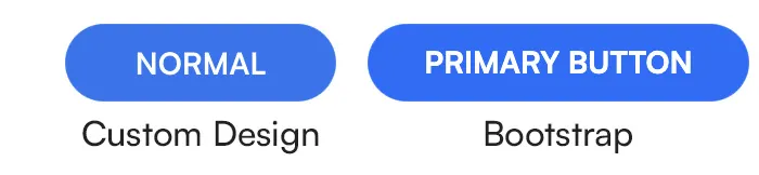
Looks pretty close, right? Of course, there are more nuances: different states of buttons like hover, active, disabled, different sizes of them, etc. But the approach should always stay the same:
Change what you can via Bootstrap variables, and handle the rest via overwritten styles.
This keeps your design system consistent and flexible.
Conclusion
In this article, we reviewed how to modify the default Bootstrap theme to fit your custom design. As a result, you should now have:
Modified Bootstrap variables related to buttons.
A
_btn.scssfile with all overwritten styles for properties that can’t be handled via variables.
In the following post, we’ll tackle situations where customizing Bootstrap components requires going beyond variables. Stay tuned!